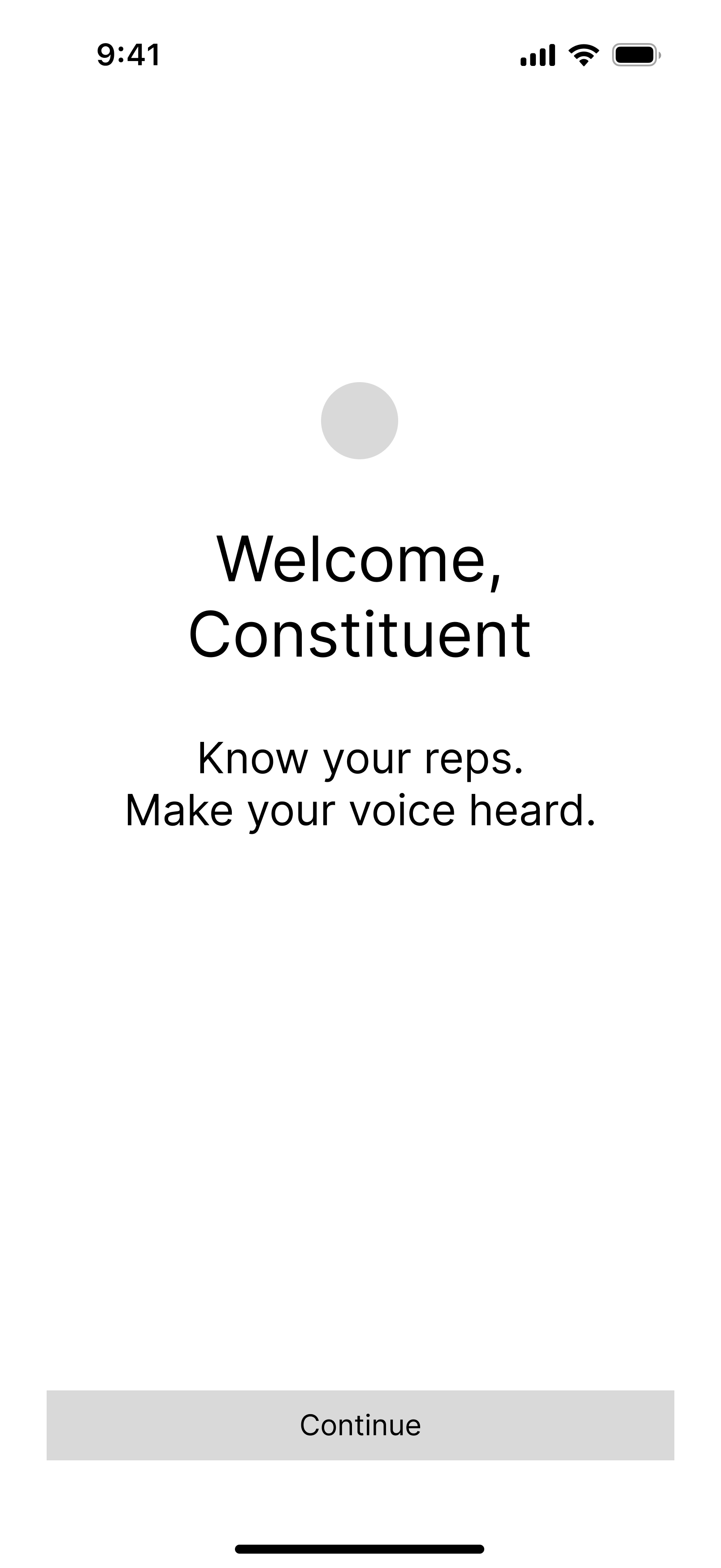
Constituent
Know your reps. Make your voice heard.
Type
Passion Project
Timeline
2025–Present
Role
Product Designer + UX Researcher
Platform
iOS
Tools
Figma, Claude, Pen + Paper
Building a civic tool that empowers everyone to participate in democracy.
Constituent is a mobile-first civic tech app that allows users to identify and contact their elected representatives at all levels of government and all in one place. Its namesake serves as a reminder that elected officials work for us, and we all play a part in making sure they remain accountable for their actions.
As a self-initiated project, I led every phase of the design process, from research and problem definition through prototyping and developer handoff.
Civic engagement is harder than it should be.
For people who want to make their voices heard, it can be difficult to know where to start. Existing civic tools (especially government websites) are often clunky and fragmented, making it hard for people to find clear information, contact their representatives, or keep up with issues that matter to them.
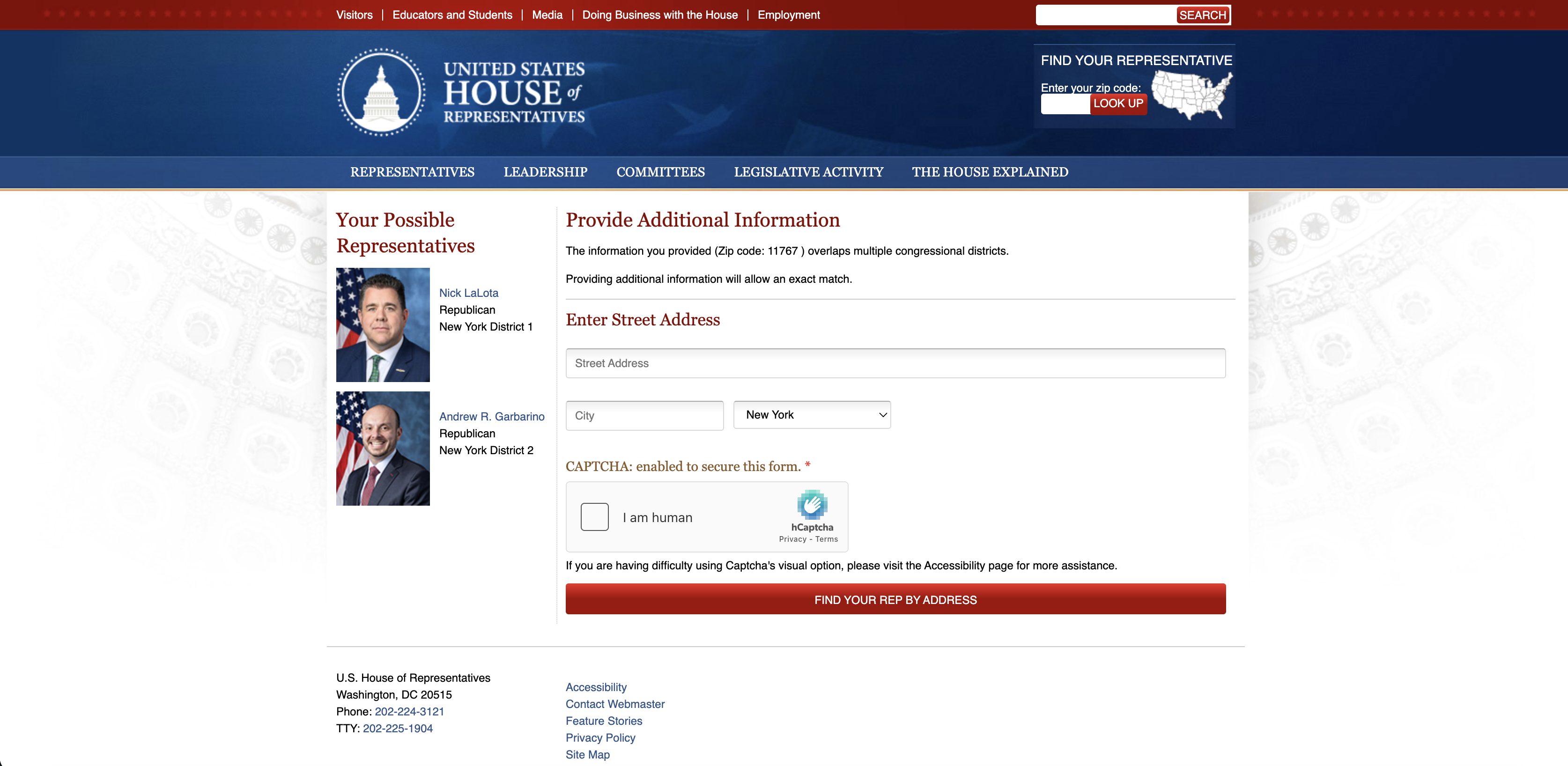
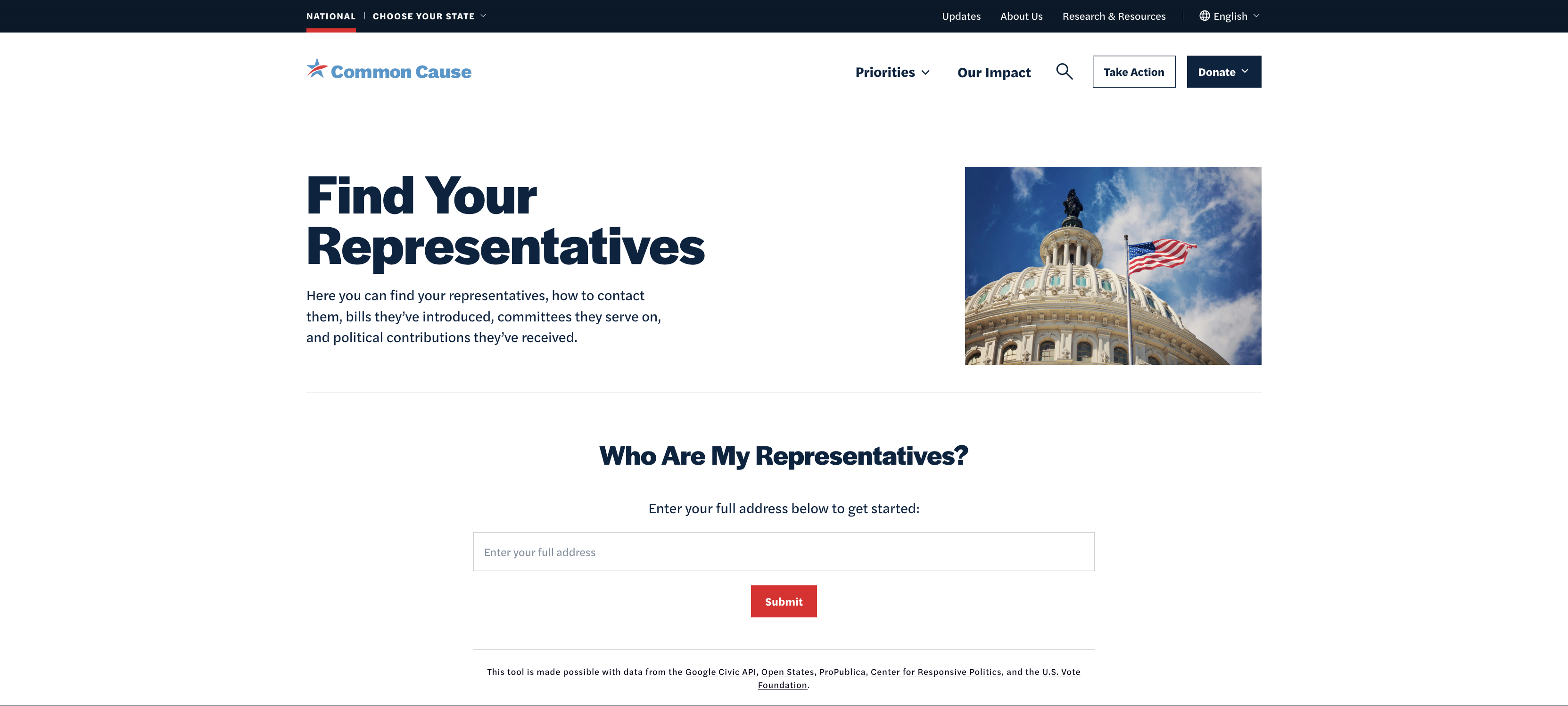
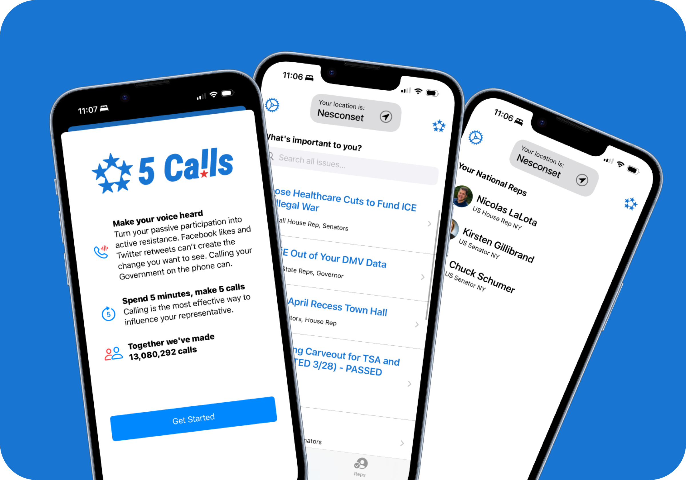
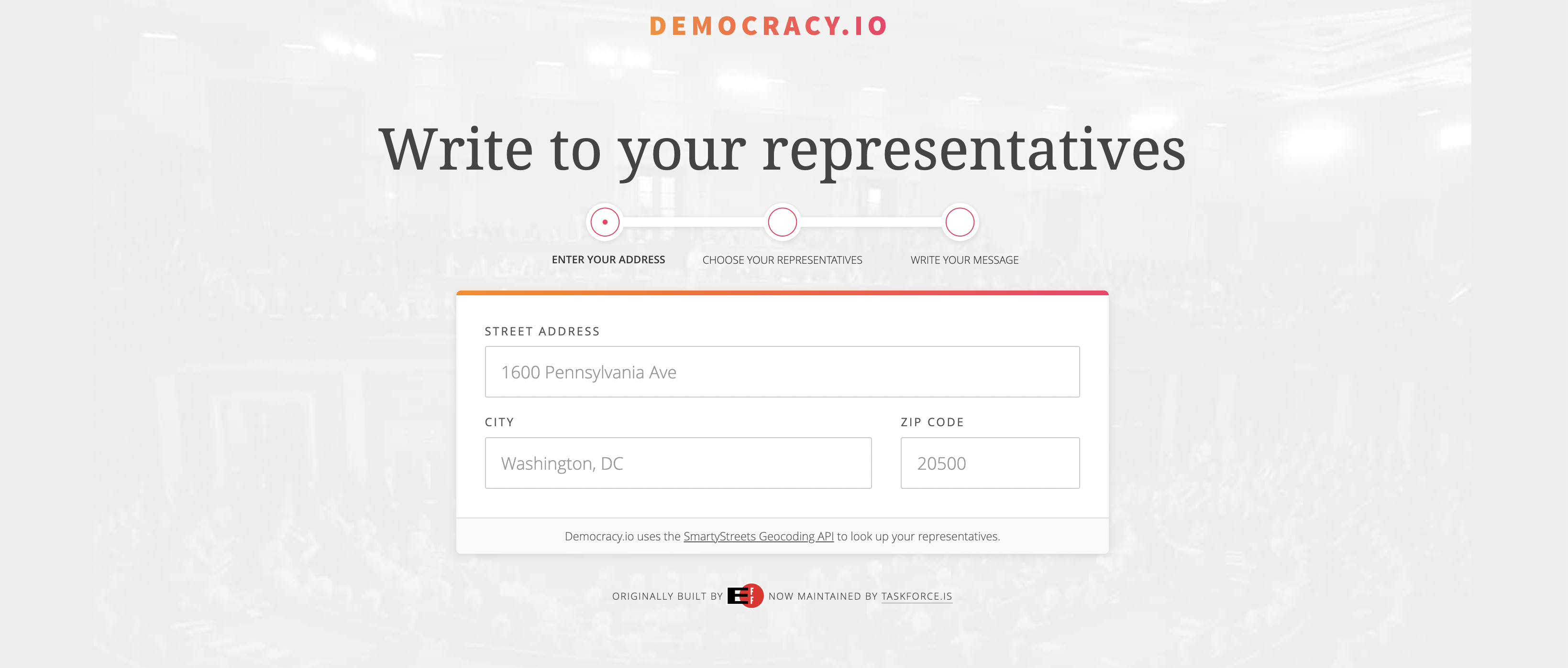
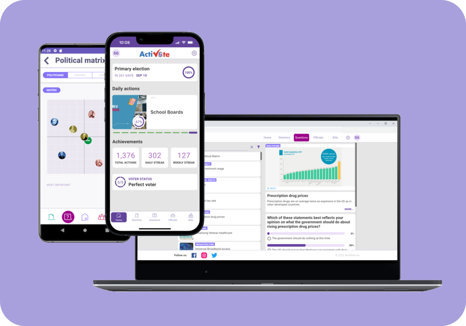
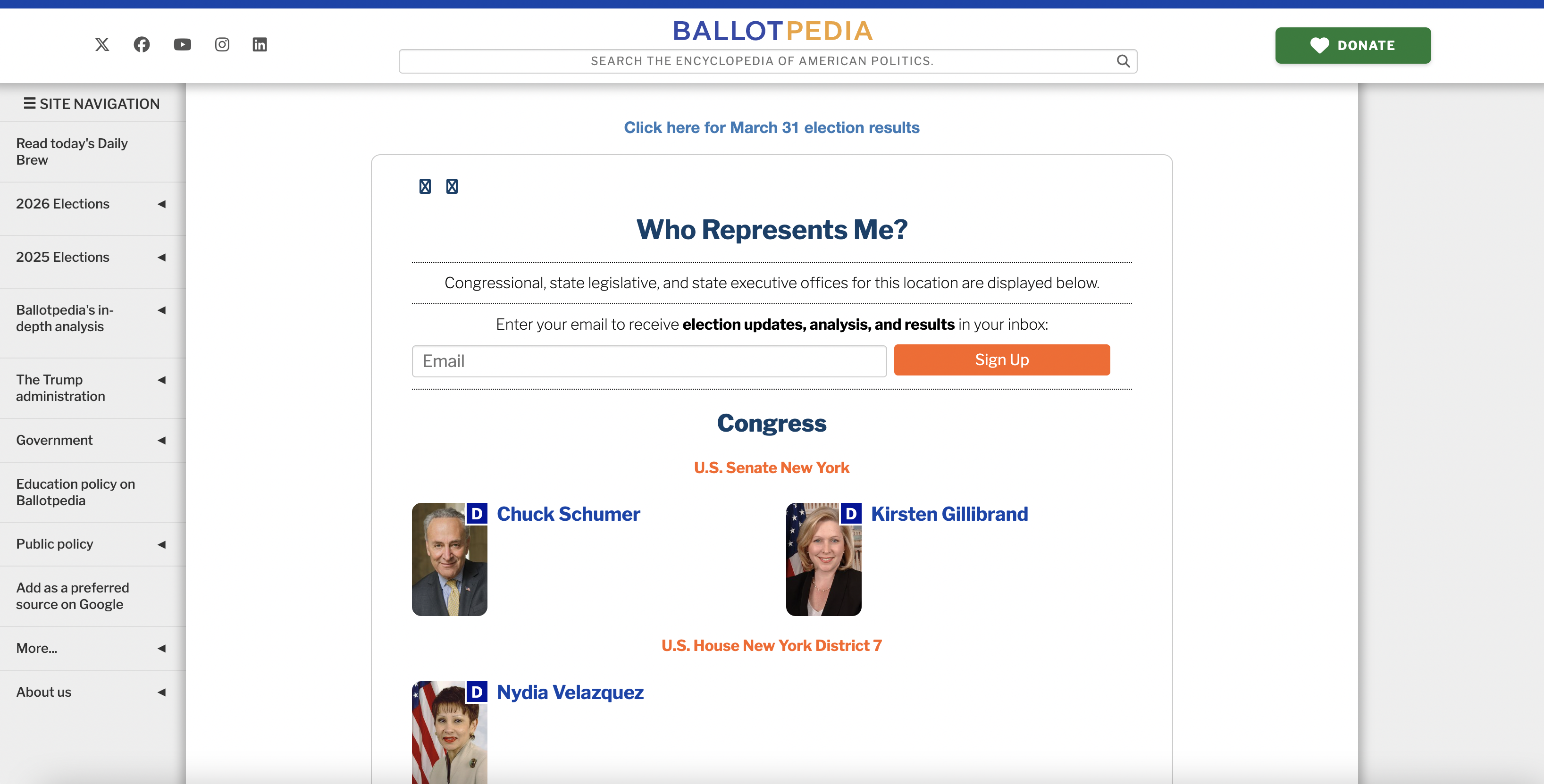
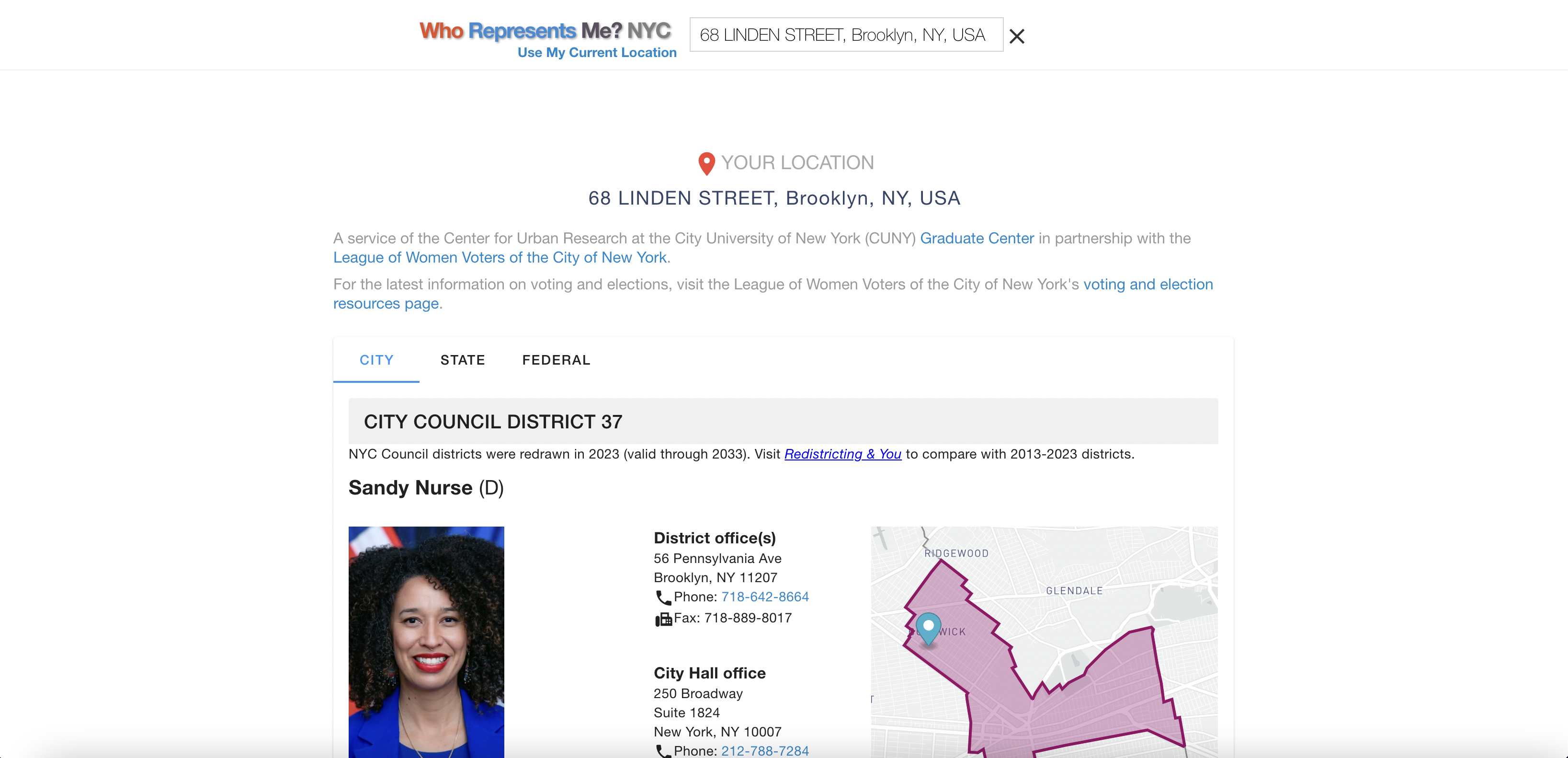
The current landscape for finding info on elected officials is fragmented by design-level, device, and use case, leaving everyday people to stitch together their own process across multiple sites and platforms.
What are some of the main barriers to civic participation?
Through a survey (50+ respondents), 5 user interviews, and competitive analysis of 7 tools, I explored how people across different levels of civic engagement currently find information about their elected officials—and why the process often stops them from taking action.
It's demotivating that the information is not easily findable and that it's not all in one place. It takes a lot of time and effort to get an understanding of your reps.
— Survey response
From the research, four key insights emerged:
Scattered Information: Users have to visit multiple websites to find basic information about their representatives, making a simple task unnecessarily time-consuming.
Unreliable Sources: People struggle to determine which websites provide trustworthy, nonpartisan, and up-to-date information about elected officials.
Outdated Government Sites: Official government websites are cluttered, slow, and difficult to navigate (especially on mobile devices where most people search).
Lack of Feedback: People question whether their outreach actually matters, with no confirmation or sense of collective impact which makes it easy to give up after the first try.
Centering user needs
With a clearer picture of the problem space, I created personas and journey maps to translate these research findings into a human story, revealing distinct user needs and pain points. Amal Greene became my primary anchor: someone who wants to be more civically engaged but doesn't know where to start or whether her voice will land.

Amal Greene
"I care about what's happening — I just wish it were easier to turn that care into action. I don't always know where to start."
- • Age: 29
- • Location: Queens, NY
- • Occupation: Operations associate at a retail company
- • Education: Bachelor's degree
- • Tech proficiency: High (smartphone native)
Bio
Amal juggles a full life in Queens — balancing time with friends, taking care of herself, and keeping up with a demanding job. Living with a chronic illness has made her especially aware of how policy decisions shape everyday life. Amal cares deeply about healthcare and environmental issues and wants to be more civically engaged, but often struggles to find clear, accessible ways to take action.
Goals
- •Understand who represents her at all levels of government.
- •Stay informed about policy decisions related to healthcare and environment.
- •Take meaningful action when issues she cares about are at stake.
- •Feel like an engaged citizen without it consuming all her time.
Pain Points
- •Feels overwhelmed by the amount of information scattered across the internet.
- •Finds it hard to know if the information she finds is reliable.
- •Has limited time and energy to research issues in depth due to work and health management.
- •Unsure which representative to contact about specific issues.
Motivations
- •Wants to be an informed resident and engage beyond just voting.
- •Feels urgency around issues that directly impact her life.
- •Values efficiency and will engage more if the process is simplified and streamlined.
- •Wants to feel that her voice and action will make a difference.
Narrowing the focus
Next, I needed to distill everything I learned into a single, honest articulation of the problem — one I could keep returning to as a gut-check throughout the design work. Grounding this in Amal's story kept the process honest:
Amal is an eager community member who needs to find relevant information on government policies and representatives, because she wants to stay informed and act on issues that affect her daily life.
With the problem defined, I could articulate what a successful solution would actually need to deliver. The goal statement:
The platform will allow users to stay engaged with issues they care about by consolidating the process of looking up and contacting elected officials into one organized, approachable experience. I will measure effectiveness through task completion rates and user satisfaction in usability testing.
Project scoping
To inform my early ideation process, I started with a HMW statement:
How might we simplify how people discover information about their elected officials?
Keeping Amal in mind, I then began zeroing in on the product's core features and target audience. I chose to design for the users who showed up most in my research: people who are somewhat to moderately civically engaged and also eager to do more.
How would you describe your level of civic engagement?

Over 63% of people surveyed consider themselves somewhat to moderately engaged in civic activities, revealing a clear majority to design for.
Three MVP features emerged from their needs:
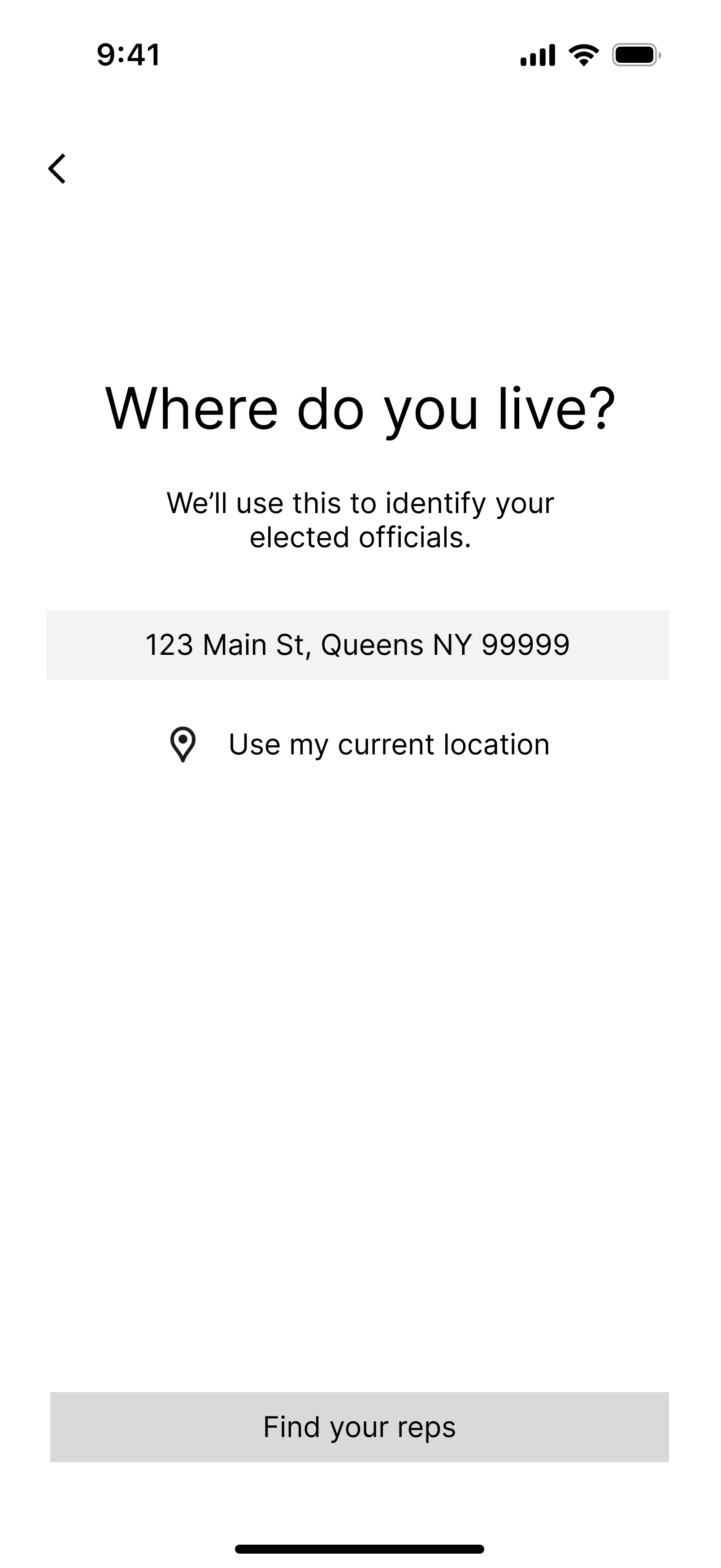
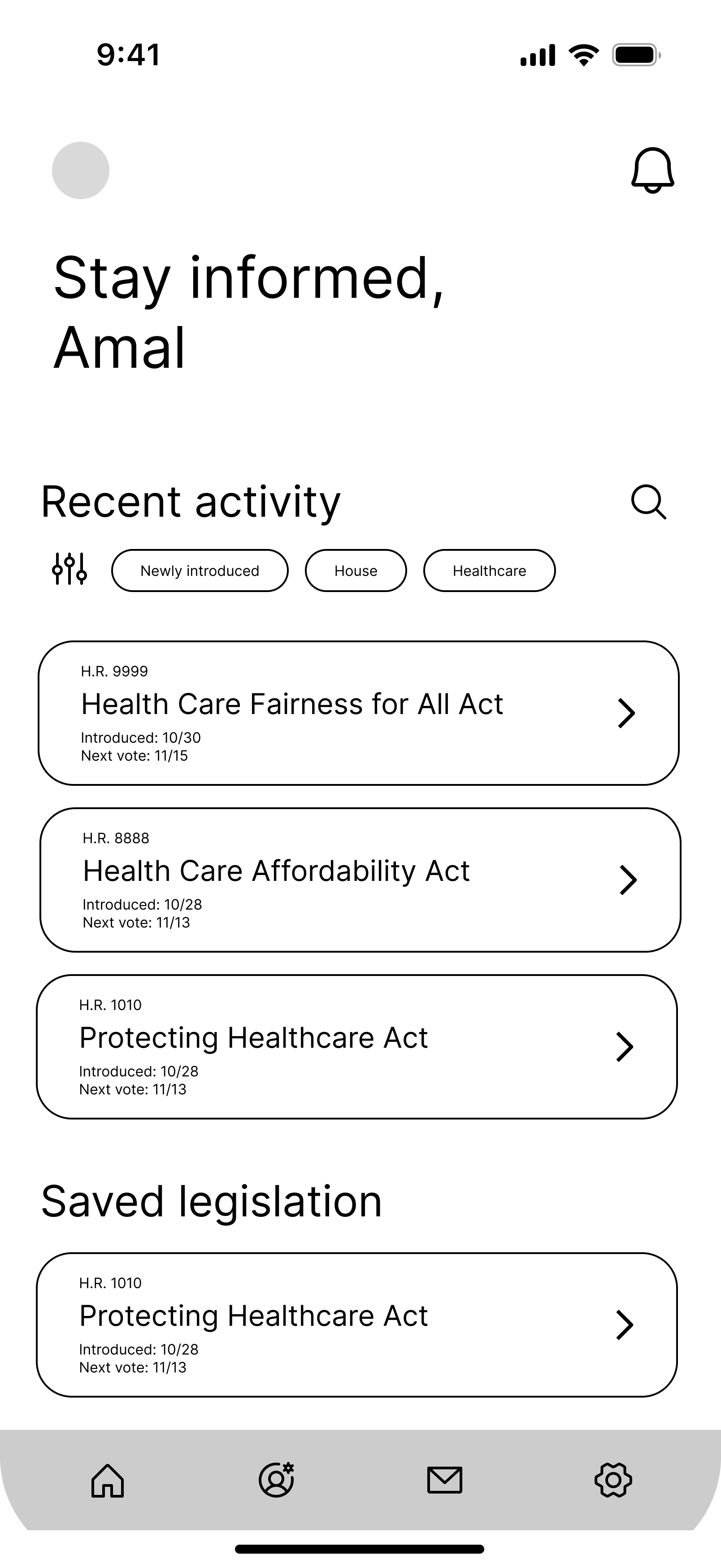
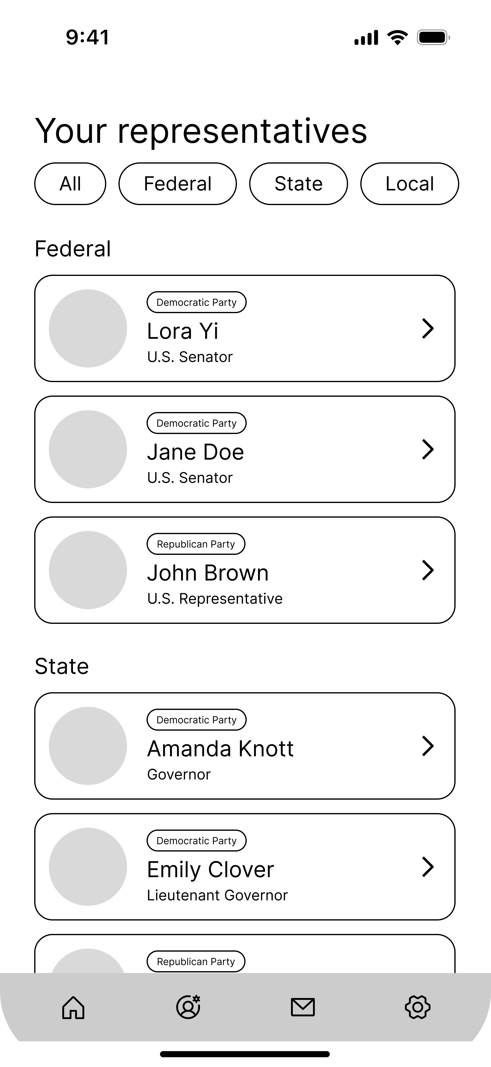
Representative lookup: Enter your address once and see all your elected officials across federal, state, and local levels in one place.
Rep profile overviews: Browse basic information about each representative (biography, committee assignments, recent activity, etc.)
Multi-rep contact flow: Reach out to one or multiple representatives at once, with the option to write your own message or start from a template.
I kept the MVP focused on these three features deliberately. Features like bill tracking, notifications, issue-based filtering, and impact stats are all on the roadmap, but scoping them out of v1 meant the core experience could be built, tested, and validated first.
Information architecture
Before diving into any design work, I created a sitemap to establish the app's underlying structure. Navigation is focused around the two actions that matter most in v1: finding your representatives and contacting them. From there, I mapped out the key user journey, accounting for the choices a user might face and defining a clear happy path.

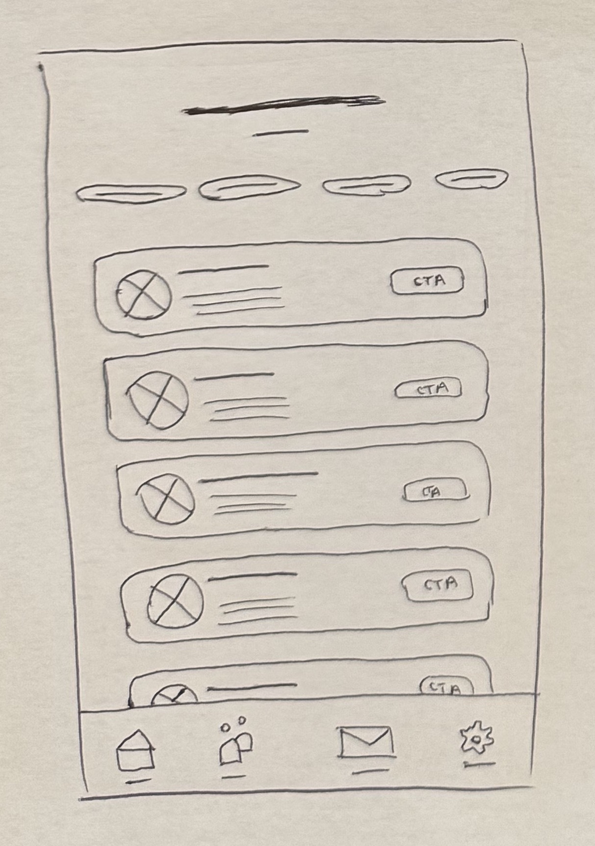
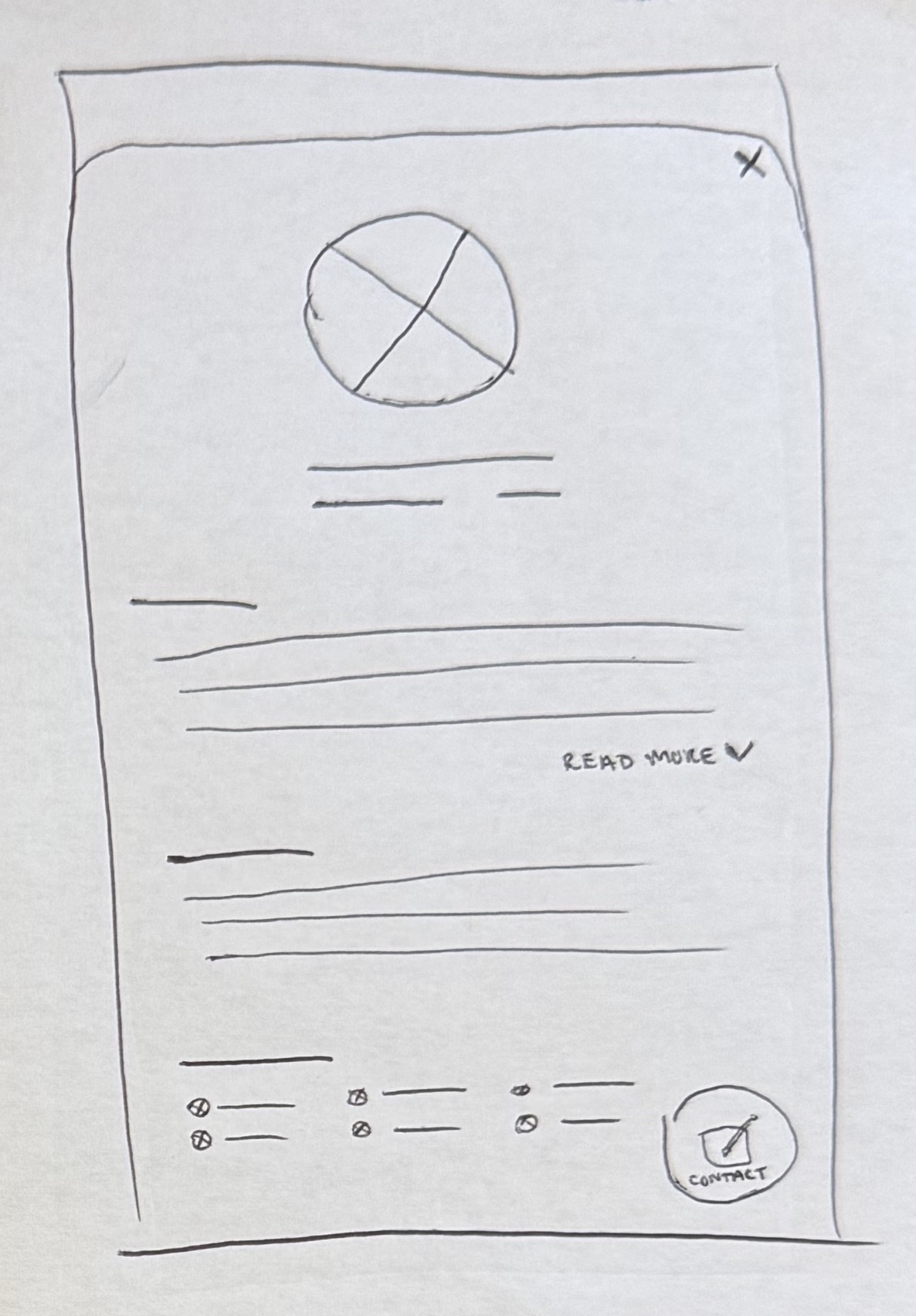
Drafting wireframes
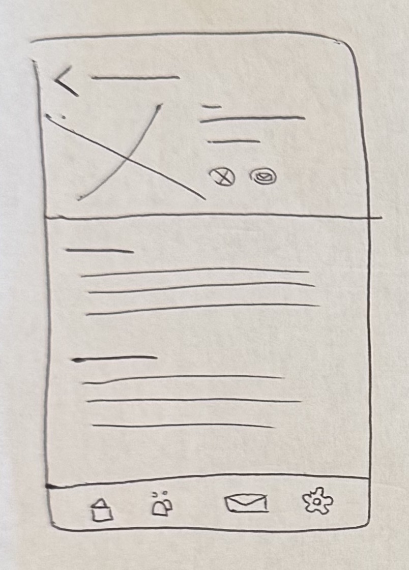
I started with paper sketches to explore potential layouts before combining the best elements from each into digital lo-fi wireframes. These wireframes helped identify potential usability issues early and establish a strong foundation for the visual design.
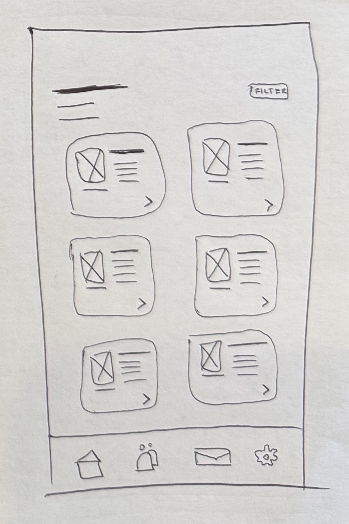
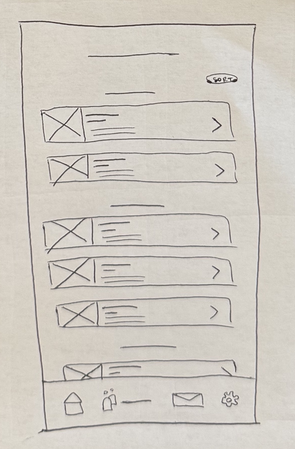
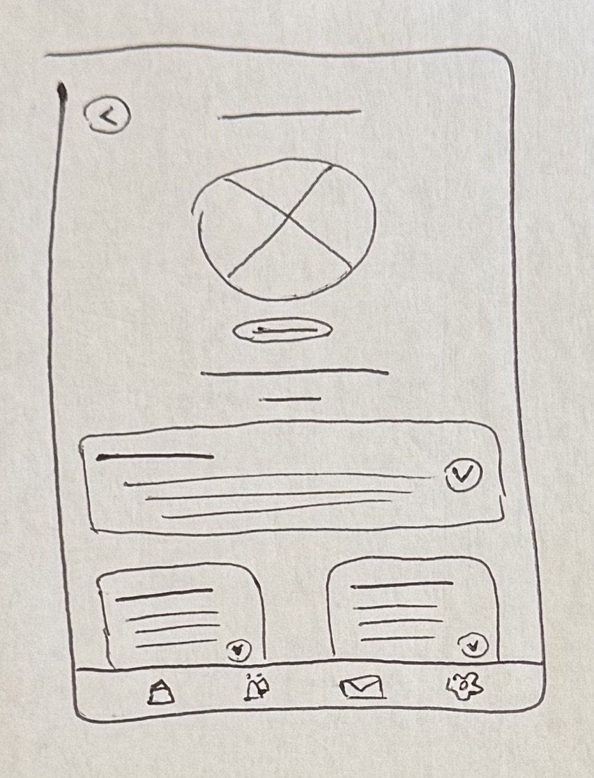
Early sketches exploring layout options for the core screens.
Lo-fi wireframes translating the best sketch ideas into a testable structure.
Final designs
After validating the structure through wireframes, I moved into high-fidelity design, studying successful UI patterns in directory and contact flows (Dribbble and Mobbin were especially useful resources) and developing a basic design system to apply to the screens.
Here's a breakdown of Constituent's key features and visual design system:
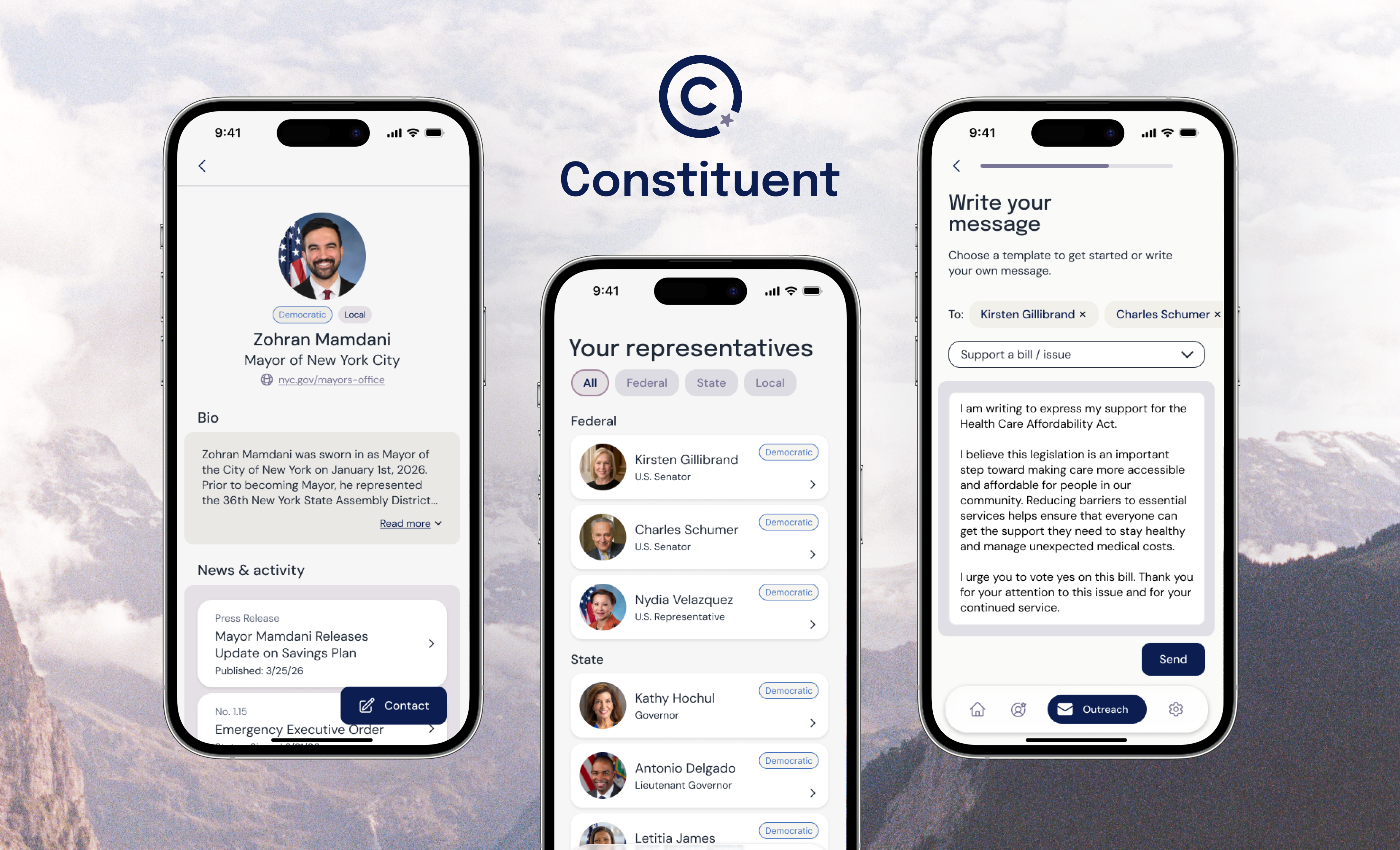
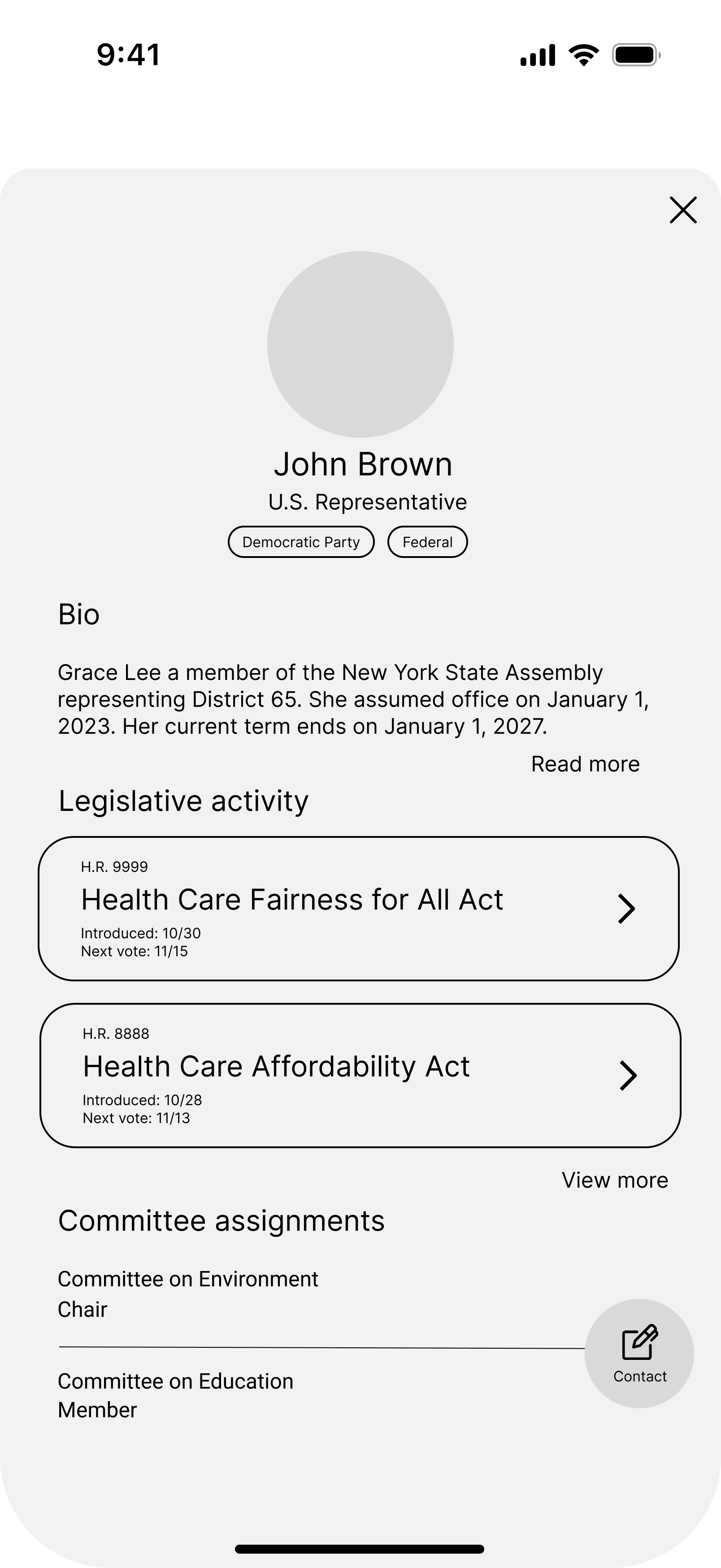
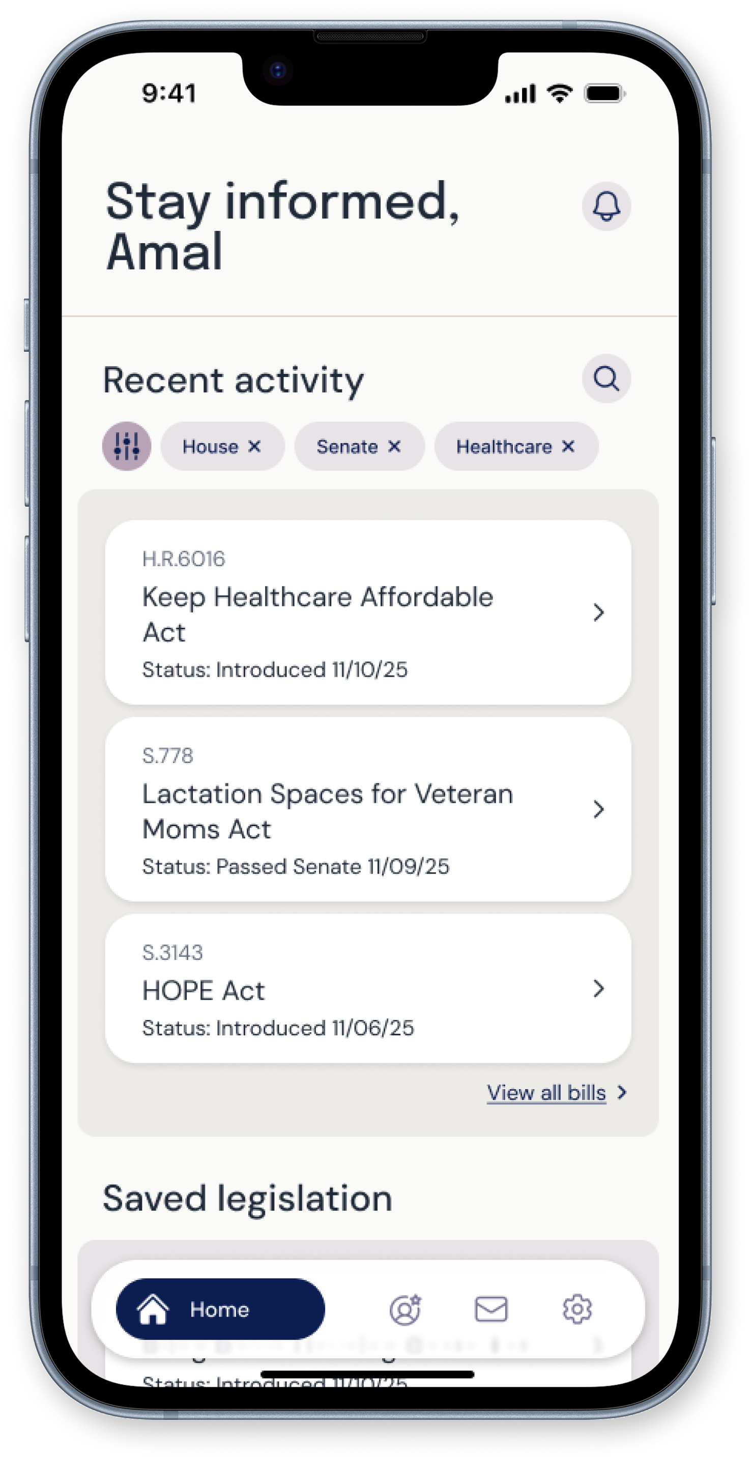
Rep directory + profiles
Users can view all of their elected officials in one place. Each rep profile surfaces the information people actually look for, like biography and recent legislative activity. From the profile, users can contact their representative directly through the in-app form, or find alternative contact methods like phone numbers and mailing addresses.
The goal was to prioritize the most sought-after information without overwhelming users who are just getting started.
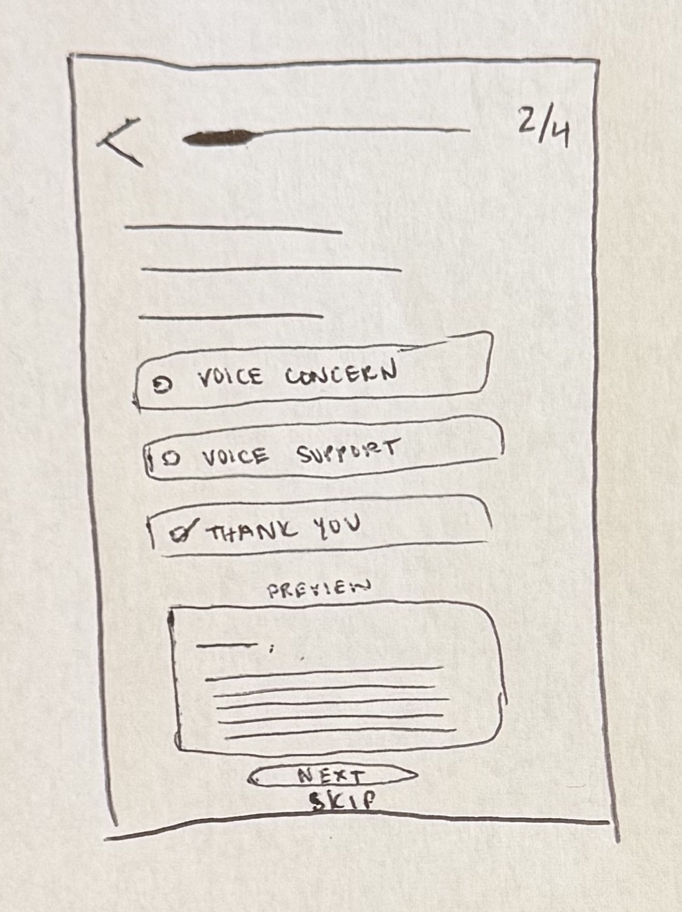
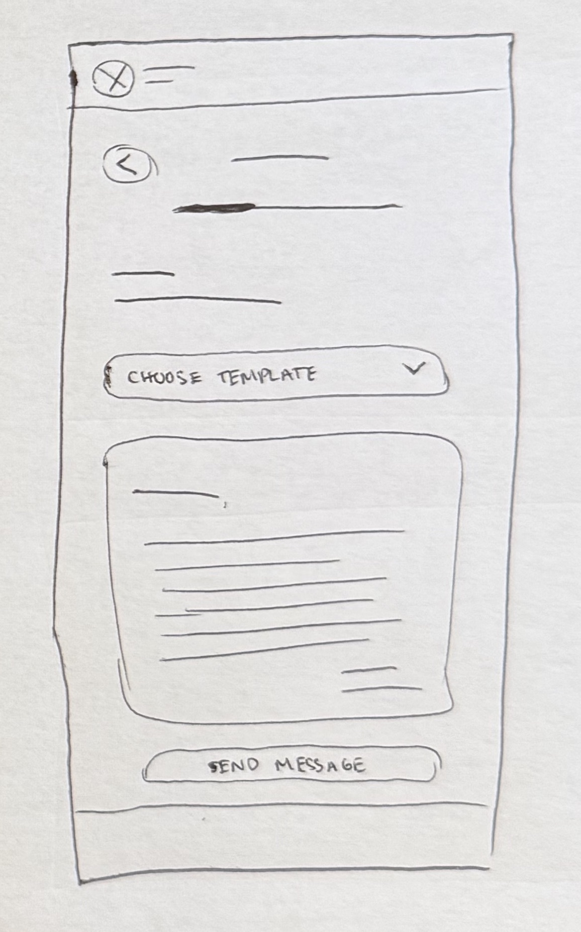
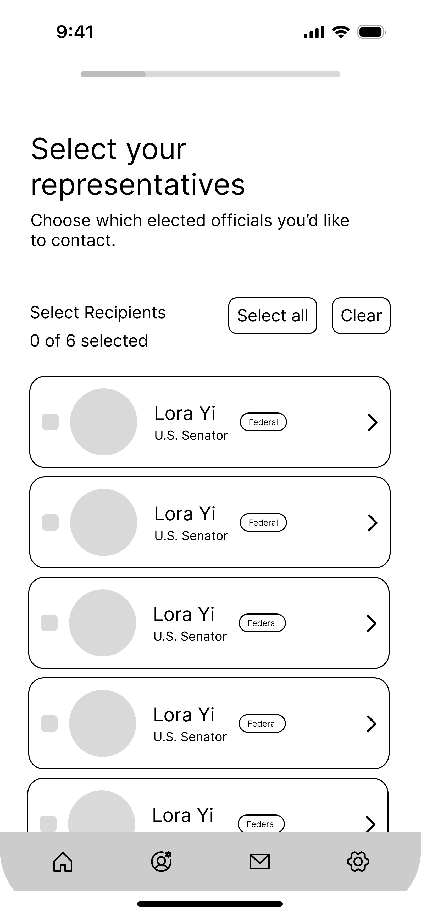
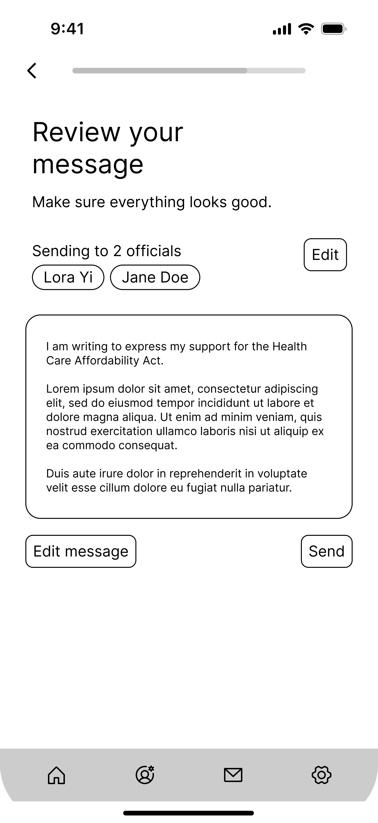
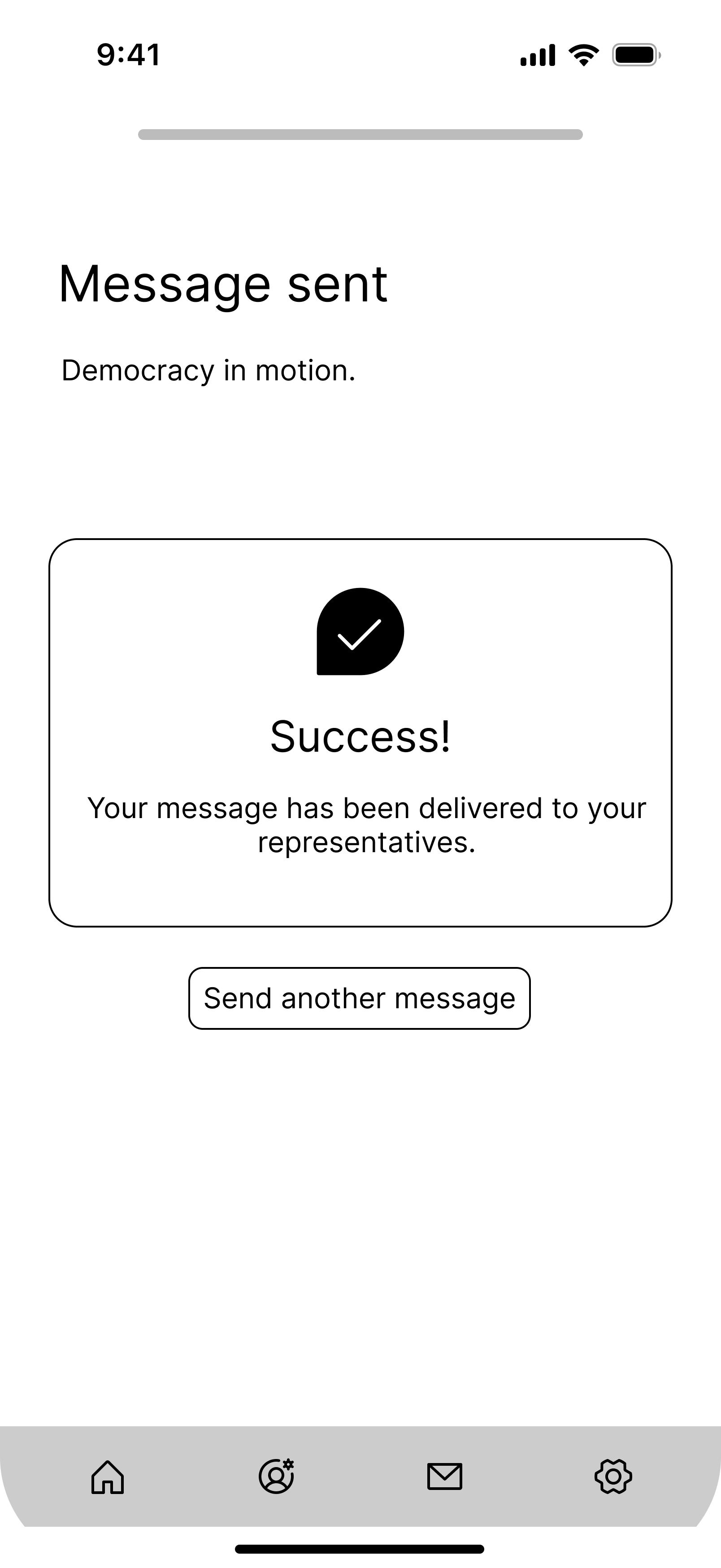
View prototype →Multi-rep contact flow
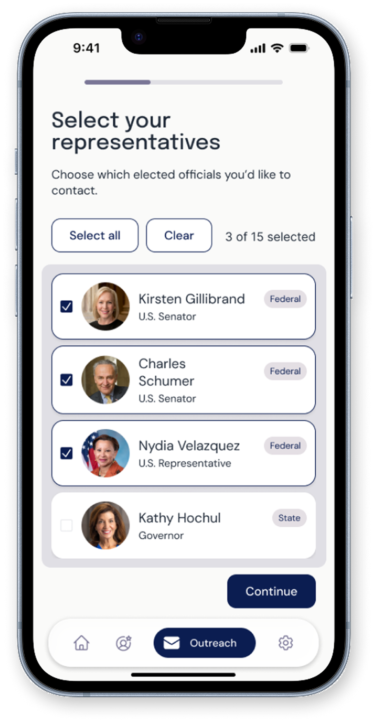
Select which representative(s) to contact
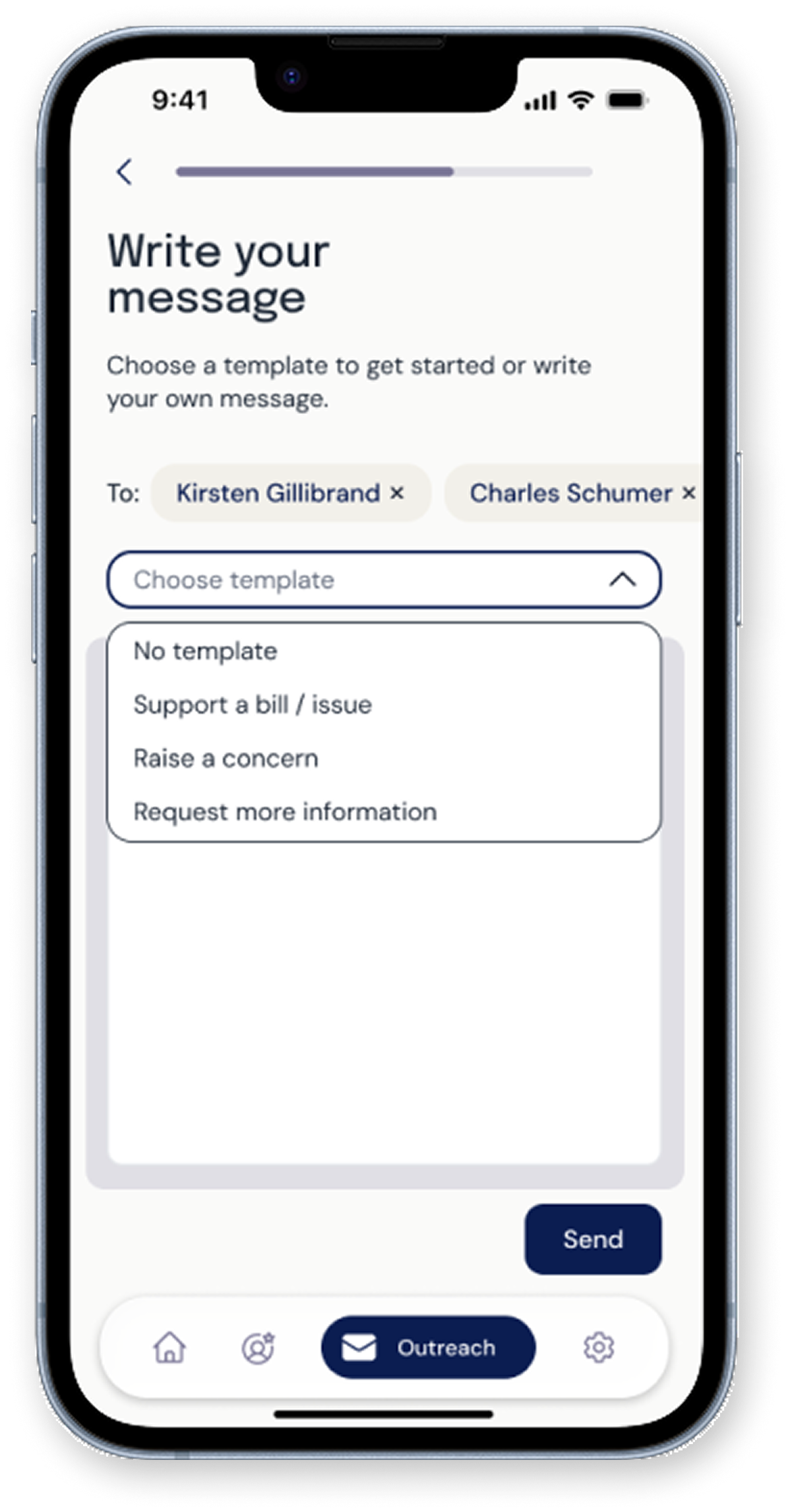
Choose a template
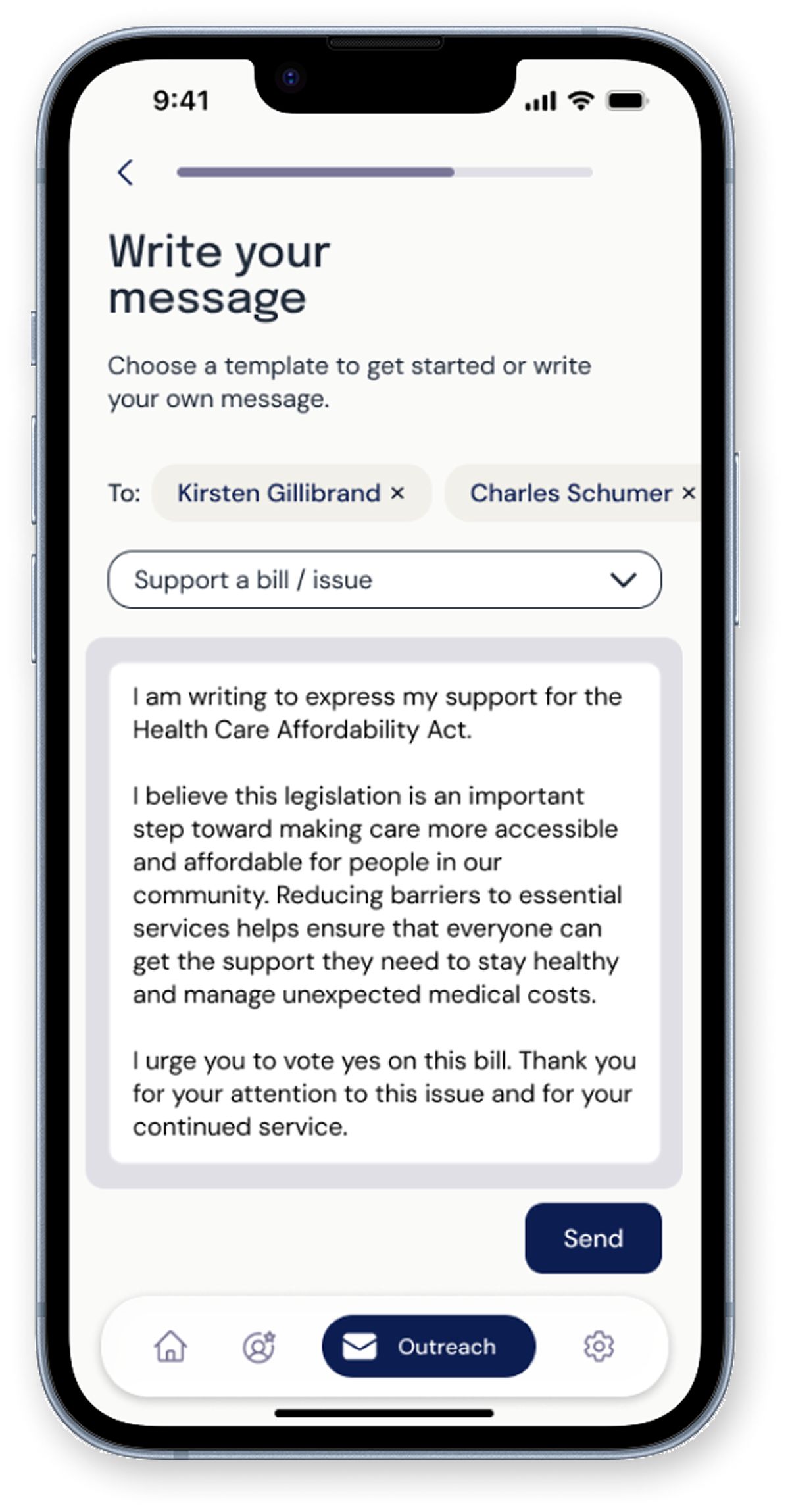
Customize your message
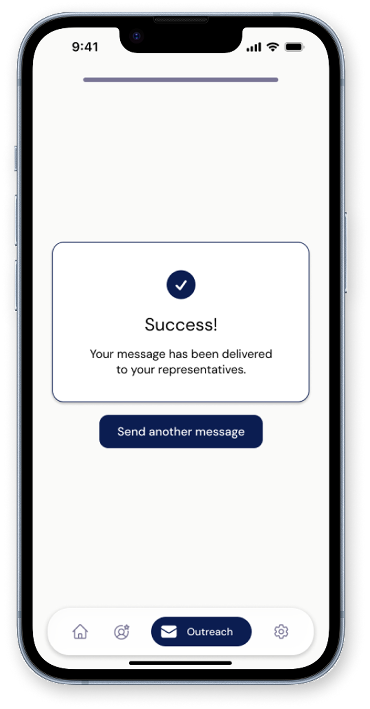
Send message
Select which representative(s) to contact
Choose a template
Customize your message
Send message
The primary flow is where Constituent's core value plays out. Users can contact multiple representatives at once and choose from message templates if they need help framing their outreach. The multi-rep capability was a deliberate design choice: one of the biggest friction points in the current landscape is having to repeat this process from scratch for each official.
The primary flow is where Constituent's core value plays out. Users can contact multiple representatives at once and choose from message templates if they need help framing their outreach. The multi-rep capability was a deliberate design choice: one of the biggest friction points in the current landscape is having to repeat this process from scratch for each official.
Visual design approach
I wanted to balance civic professionalism with approachability, creating an interface that feels trustworthy without being intimidating. The visual language needed to communicate nonpartisan reliability while remaining modern and accessible to digital-native users.
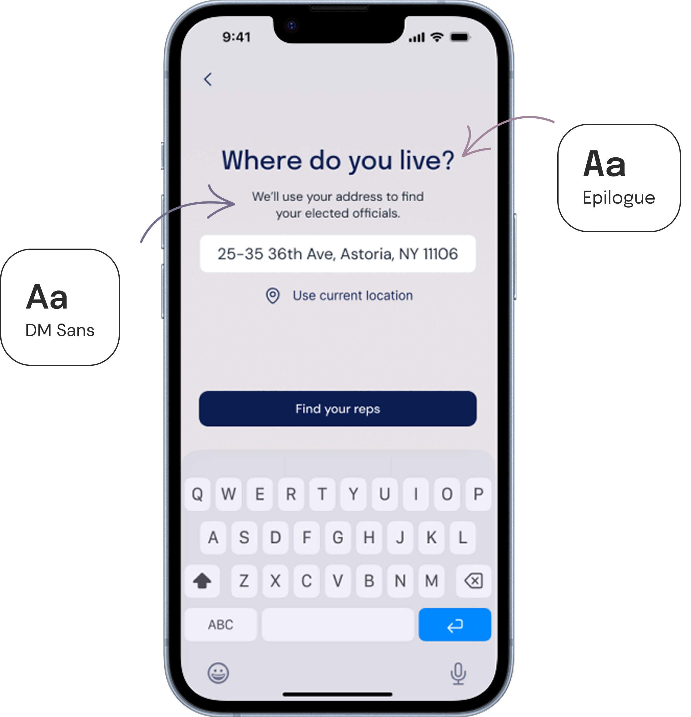
Color palette
Deep navy anchors the design with classic civic trustworthiness, while light purple and soft neutral hues add warmth, in addition to distinguishing the app from typical government blue. Purple was also intentionally chosen for its association with nonpartisanship.
Brand Colors
Deep Navy
#0B1D51
Lavender Grey
#797596
Mauve
#A1869E
Warm Taupe
#BBADA0
Cream
#D1C6AD
Typography styles
I chose Epilogue for headings because it carries quiet authority — geometric and minimal, but with just enough personality to feel distinct from the sterile sans-serifs common in government design. I paired it with DM Sans for body text, which prioritizes clarity and legibility while maintaining a polished, modern look.
Design system and components
I established rules for color application, typography, hierarchy, spacing (based on a soft 8px grid), and component behavior. This systematic approach creates a unified experience while ensuring the design remains scalable and maintainable.

Visual design approach
I wanted to balance civic professionalism with approachability, creating an interface that feels trustworthy without being intimidating. The visual language needed to communicate nonpartisan reliability while remaining modern and accessible to digital-native users.
Brand Colors
Deep Navy
#0B1D51
Lavender Grey
#797596
Mauve
#A1869E
Warm Taupe
#BBADA0
Cream
#D1C6AD
Accessibility considerations
Equity and inclusion is central to my design philosophy, so I made sure that accessibility featured into my design decisions early on, not just after the fact:
High Contrast: Text color combinations meet or exceed WCAG AA accessibility standards, ensuring legibility for users with visual impairments.
Accessible Touch Targets: Interactive elements are 44x44px minimum with adequate spacing, supporting users with motor impairments or limited dexterity.
Clear Structure: Consistent layouts and descriptive labels create predictable patterns that reduce cognitive load and support screen reader users.
Next steps
Constituent is currently in development with an engineering partner. At the same time, I'm running a usability study on the primary contact flow, with plans to iterate on the designs as findings come in.
Immediate next steps include incorporating study results, designing additional flows and screens (bill summaries, outreach impact stats, etc.), and continuing to seek feedback from other designers along the way.
Key takeaways
Working on this project truly helped me grow my skills as a designer and researcher. I learned the importance of defining a clear MVP, seeking feedback often, and investing early in a design system — all of which helped in keeping the work focused, efficient, and user-centered.
More than anything, Constituent deepened my interest in the world of civic tech. My biggest takeaway from this project is the reminder that (good) design is one of the most powerful tools we can leverage to make democracy more inclusive and strengthen civic (people) power.